"We have a great, fresh new logo, and we love it. Both in the process by which we decided upon it, and in its visual depictions, it sums ICI up brilliantly."
Nick Weatherill, ICI's Executive Director invites us to take a close-up look at the Organisation's new visual identity -- its new logo and a tagline -- and explains what it means.
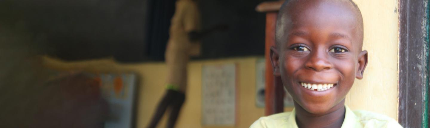
"Designed to reflect recent changes in ICI and our new strategy, this logo is the outcome of extensive consultation across our diverse membership and a small testament to the consensus we are consistently able to build across our partners. We're also happy to report that the strongest opinions came from our colleagues in Africa, who guided us on the symbolism of the colours and images. Thus we have the optimistic yellow of sunshine, creativity and prosperity, with the maternal green of nature, fertility and growth, in 2 shades of the colours commonly found on cocoa farms and in cocoa pods. As for the images, they speak for themselves, with an adult hand protecting a small child's hand, preventing it from plucking the heavy cocoa pod, guiding it, or perhaps playfully clapping. The symbolism of child protection, child learning, and children's happiness in cocoa-growing communities is resonant.
We’ve also got a simple new tagline to go with the logo: Putting children first. Because that’s what we do. We put the interests of children first in our efforts to promote and support cocoa sustainability. We put children first in community development. And we put children first in our influencing work, ensuring that their voice is heard in the policy debates that shape their future."